CAD for Virtual & Reality

Final Project

Tactile Map of Fort Ticonderoga

When I presented my final project proposal of creating a tactile map of Fort Ticonderoga, the fabrication component of the map was the goal. However, as continued to work through it, the project became less about fabrication, but more about doing research and making informed decisions about creating a map. It was more than just identifying geographic coordinates, obtaining terrain data, creating a mesh, and carving the map with a CNC machine. The project was less about the map itself, but rather asked the question: what stories should a map tell?

Tactile Map Best Practices

I started this project with some questions about creating a tactile map: what are the best practices for sizing and understanding terrain? Before starting on a model, I referred to studies and standards on tactile maps to help guide some basic design principles and provide parameters. The Guidelines and Standards for Tactile Graphics by the Braille Authority of North America outlined design considerations and suggestions for map size and scale. Some key takeaways:

  • Size: should be a two-hand span maximum. Portable non-collapsible maps should be from 8.5 by 11 inches to 11 by 17 inches to provide basic representations of an area.

  • Scale: The level of graphic abstraction should be meaningful; this may mean more literal representations of features.

  • Details: There needs to be a middle ground between complexity and simplicity. The user should be able to easily identify different elements but also have enough information for the map to be useful.

  • Finish: A matte surface would be best for moving fingers around the map.

  • Labels: Symbols or labels should be placed no closer together than 1/8 inch.

A Tale of Two Maps

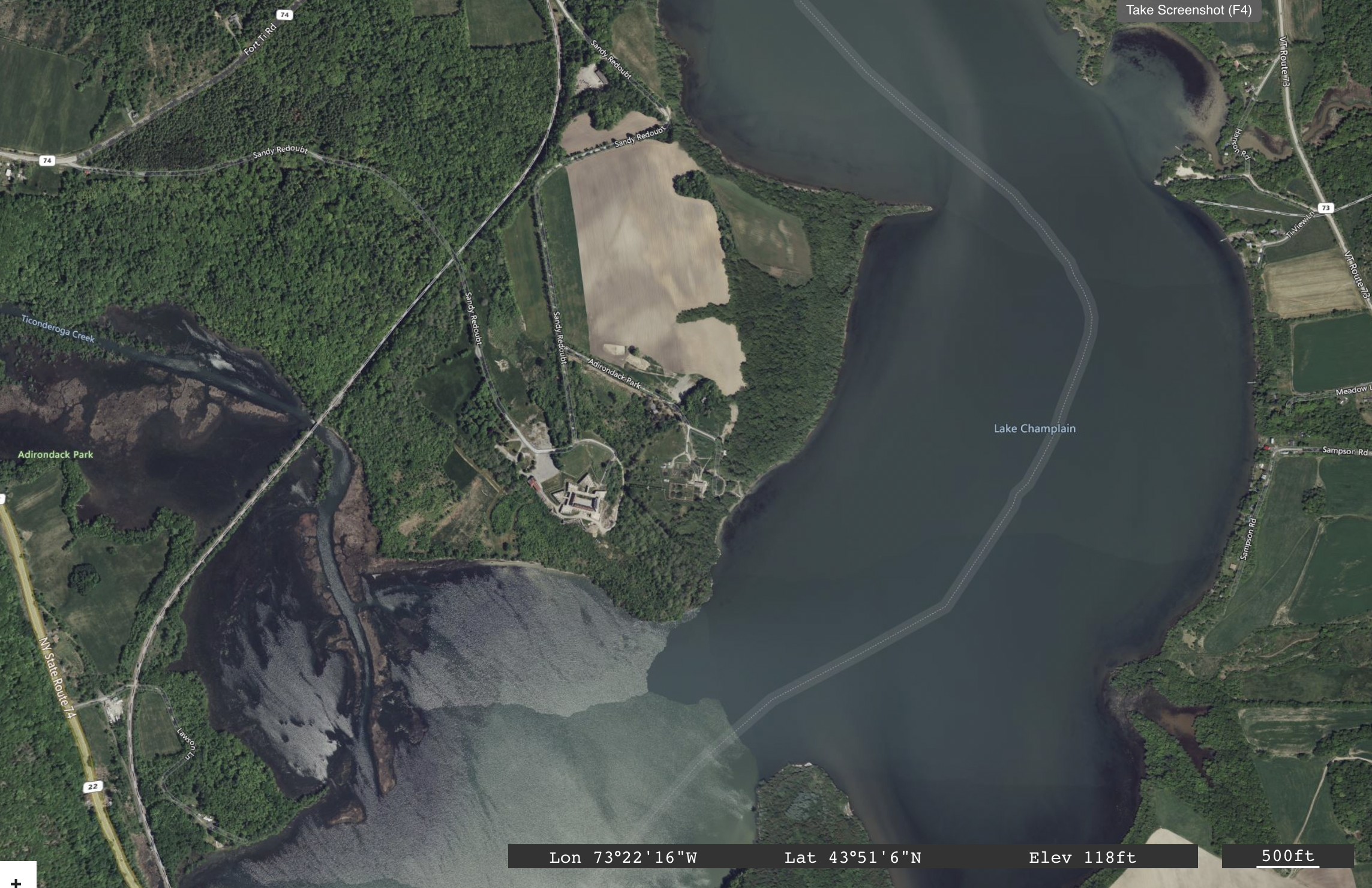
On the left is a map of Fort Ticonderoga “taken from an Actual Survey & and other Authentick Informations” (per the inscription) and in 1777. It also notes relevant landmarks. On the right is the same approximate area (attempting to match up certain geographic features) from a present day ESRI satellite image. While landforms do change over time, there’s a visible inconsistency between the illustrated map and the satellite capture. Which source would then best serve as the basis for this tactile map? What is the story being told?
Evaluating Terrain

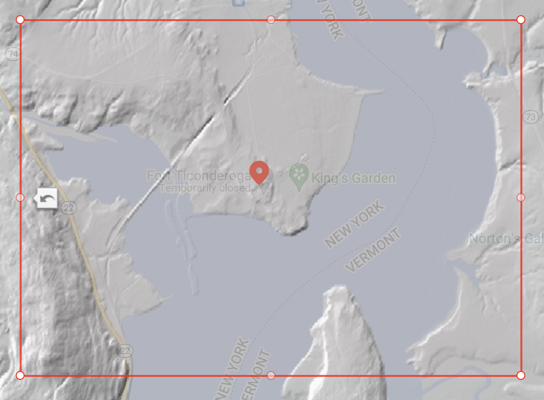
While Fort Ticonderoga had important geographic significance as a battle sit due to river access from New York City and proximity to Quebec City and Montreal, the terrain itself is expansive but does not come with a lot of change in elevation. This potentially results in a less interesting mesh file for a terrain map and subtle features to explore in a tactile map.

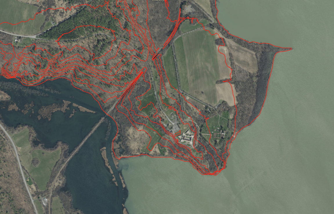
On the left is a screen capture from TouchTerrain, generated from USGS 3DEP National Map Seamless 1/3 Arc-Second (10m) data; on the right is a bird’s-eye view image of the same area.
Approach #1: Terrain Mesh

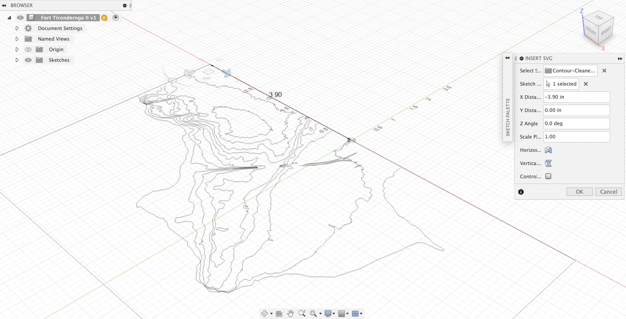
Approach #2: Contour Map

Week 10: Final Project

Over the next (and last!) few weeks of CAD, we’ll be working on our final projects. My project proposal is going back to a concept I worked on in Spring 2020, but I never got to fully realize and fabricate due to the start of the pandemic.

Final Project Proposal: Tactile Map

In Spring 2020, I was in the interdisciplinary Museum Accessibility course led by the NYU Ability Project and part of an IMLS grant between NYU and the Intrepid Museum. My group project members and I were assigned to address the challenge of “Places People Can’t Go” at museums and historical sites. We consulted and worked with three museums and historical sites to develop potential solutions for creating more accessible visitor experiences.

One of these historical sites we worked with was Fort Ticonderoga, home to an 18th century fort in northeastern New York (the Battle of Fort Ticonderoga was the first American victory of the Revolutionary War). However, the site encompasses over 2,000 acres of land that is challenging for physical access. How do you bring visitors to a place they can’t physically go to? One way we thought about bringing the experience of a vast landscape to a visitor was to create a tactile map that depicts the topography and geographical features. The tactile map could also incorporate smaller reproductions of infrastructure or buildings in the area.

This map was just one of several ideas we had for creating tactile objects for a museum exhibition. At the time, my group suggested constructing these maps with a Swell Form machine. However, halfway into the semester, COVID disrupted our ability to fabricate anything, since the class went completely virtual and we had no access to the shop or tools at ITP, the Ability Project, or the Intrepid Museum.

Two years later, in my contemplation of a final project in Fusion360 and potentially using a milling machine, I thought that perhaps it is finally time to try and create this tactile map – but by using the newly learned tools of CAD and CNC.

Inspiration

In researching topographic and tactile maps, I came across some that were 3D printed or made with solid wood. For inspiration, I found images like the one on Instagram below, YouTube videos, and Instructables on how to CNC or 3D print a topographical map.

Development

I still have to think through my approach for the tactile map design itself: do I use maps as my canvas and then use the sculpt feature to create the terrain? Is there data I can import to create the model? Do I focus on a specific region (such as the fort and immediate surrounding areas) or showcase the entire 2,000 acres of the site? What topographical features are most important to carve out and be able to feel?

In terms of physical fabrication, I’m leaning towards milling this map out of solid wood with a CNC.

A 1758 map of Fort Ticonderoga (known as Fort Carillon at the time).

Week 9: Generative Design

Generative Design

In Week 9, we learned to work with the generative design function and process. This feature in Fusion360 uses artificial intelligent algorithms to generate and evaluate potential design ideas. The assignment was to create generative designed object – which could be anything, but made with some realities in mind.

Inspiration

While looking through examples of generative design, I came across this image of a lounge chair and decided to see how much of it I could replicate myself in Fusion360.

Image credit: Emmanuel Touraine.

Generative Design Process

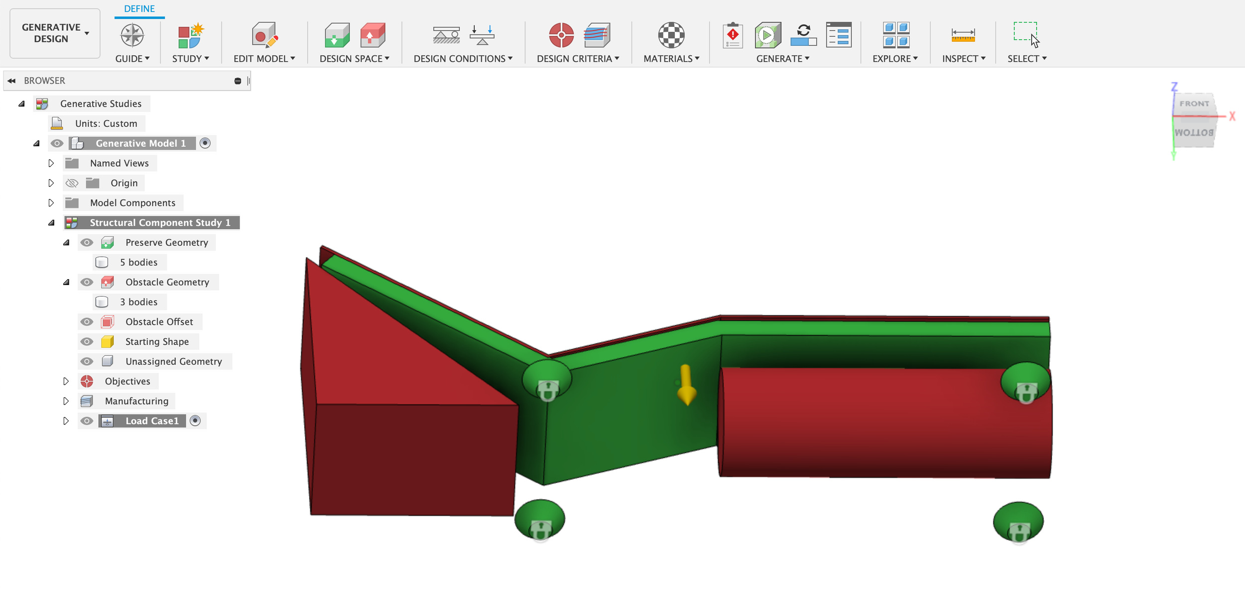
I started by creating simple extrusions to create the main body of the lounge chair and bases for the legs. These bodies would be defined as “preserved geometries.” I also then made a second body directly on top to function as one of the “obstacle geometries.”

Next, I switched over to the Generative Design feature to define these bodies as preserved or obstacle geometries, applied structural constraints to the leg bases that would touch the floor, and finally applied structural loads and forces.

After setting up all of the constraints and doing a quick pre-check, I hit the “generate” button to see what outcomes I would get. I wound up with a more simple design than expected.

This screen capture of Fusion360 shows my final result. I thought this one was the best of all recommended outcomes – but it was just a fairly simple lounge chair design.

After seeing this result, I decided to try making some tweaks to the obstacle geometries and also to the structural loads and forces itself. I decreased the load (realizing I didn’t scale my overall model correctly) and the body behind the back of the chair to see what would happen next. The image below was the next outcome: Fusion360 generated a strange but more visually interesting design to connect and hold the back of the lounge chair to the rest of the body.

It also made me wonder about what other adjustments could be made to the bodies and constraints. Would I need to create additional preserved geometries with the legs to create the more intricate design in the inspiration image? What would happen if I made the obstacle geometries behind the chair even smaller? Waiting for the generative design results of each iteration takes some patience though (multiple hours!) – but this was a fun introduction to this new tool.

Week 8: Sculpting

Sculpting in Fusion360

This week in CAD, we focused on the Sculpt function, and particularly starting with the simple box form as our base for modeling an object. To practice and better understand the tools associated with sculpting an object, our assignment was to follow this Bike Seat with T-Splines tutorial to create our own bike seat in Fusion360.

Process

The process of sculpting the bike seat began with a method of placing a top view and a side view image of the bike seat, setting them on the correct planes, and aligning them to be the same size. Once they were properly calibrated, the next step was to create a sculpt box form in the same dimensions and reducing the opacity of the body to trace the lines of the drawing in the canvas.

The sculpting process in Fusion360 required going back and forth between different areas, and shifting points, lines, and selections of faces accordingly to push, pull, or move around the shape to ultimately form it into a bike seat.

Final Model

I found this be a useful exercise for learning and practicing how to edit forms with the sculpt feature. It certainly feels less precise in trying to replicate (I can see how one bike seat could easily be different from another), but I feel there’s also a more unexpected flexibility in shaping an object through this feature.

The final model of the bike seat in Fusion360.

Week 6: Four Bar Linkages

Four Bar Linkage System

I envisioned this mechanical expression driving the sweeping movement of using an icing spatula to spread frosting on a cake. I imagined that the end effector bar (E) would be the spatula itself. I used the same sweeping motion and the values from the Mechanical Expression simulator.

The values that became the basis and also the canvas for my four bar linkage.

The animated four bar linkage with an added end effector (E).

One thing I realized quickly after I created the bars and joined them together: the BC link was “ghosting” right into the grounded AD link when I animated the model. This wasn’t something I thought about with the first linkage I made after following a tutorial. I undid the joints for this linkage and stacked the components so that the BC link was the top-most piece.

The corrected bar linkage.

To further imagine how this linkage might function, I added a rough shape of the icing spatula with a rigid joint to the end effector bar.

Week 5: Assemblies

Assemblies

Building off from the last assignment to make a double-threaded part, for this week, we shared our files to join our individual parts with 1/4-20″ threaded rods. I set up an assembly by placing my part on the bottom and then joined two additional parts from our shared folder using two 1/2” rods.

The front view of my shared assembly.

A rendered version. Looks like it could be a taper candle holder.

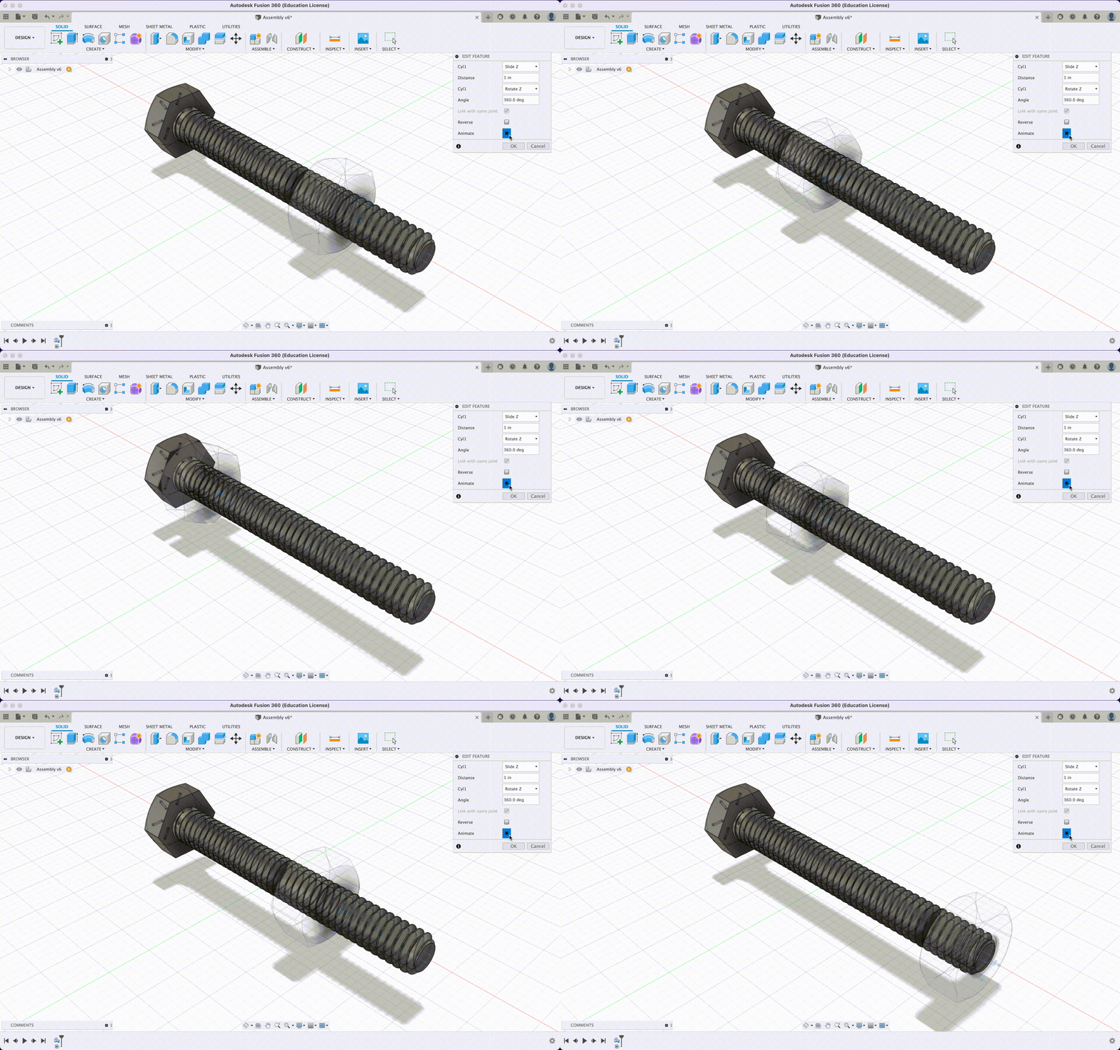
The next part of the assignment was to create an assembly and animate them. As I was still trying to practice the joint feature in Fusion360, I followed the Cylindrical Joint example tutorial, which helped me understand how to create and animate realistic movement with actual parts, including adding constraints for rotations and sliding motion like the hex nut on the thread.

An animation of a hex nut rotating along a hex head screw using motion link.

Linkages

Project Idea

After running the Mechanical Expression simulator and seeing how changing the values of each part of a four bar linkage, I chose a path that had a sweeping motion. The first idea that came to mind with this motion was using an icing spatula to apply and spread frosting onto a cake.

The inspiration.

The path generated by the Mechanical Expression simulator.

My first attempt at creating and animating a working four bar linkage.

Week 4: Working with Models

Assignment

There were two parts to this week’s assignment working with models:

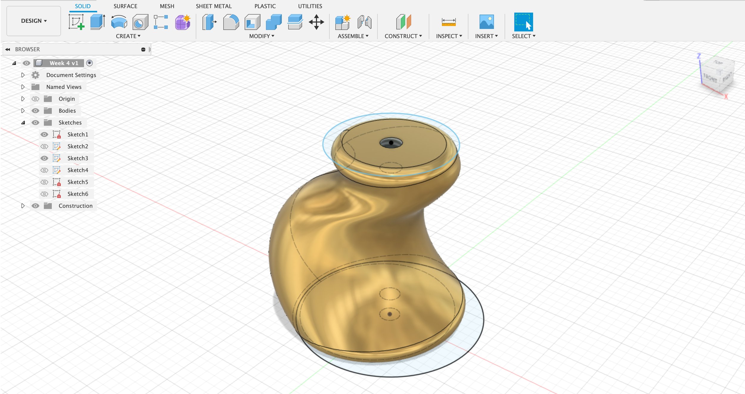
Part 1: Make a part that is roughly 2″x2″x2″ that has at least two 1/4-20″ internal threads on them. Anything goes for the shape, have fun with it.

Part 2: Make a model that is made up of multiple components, similar to the screw driver example.

Part 1: My Part

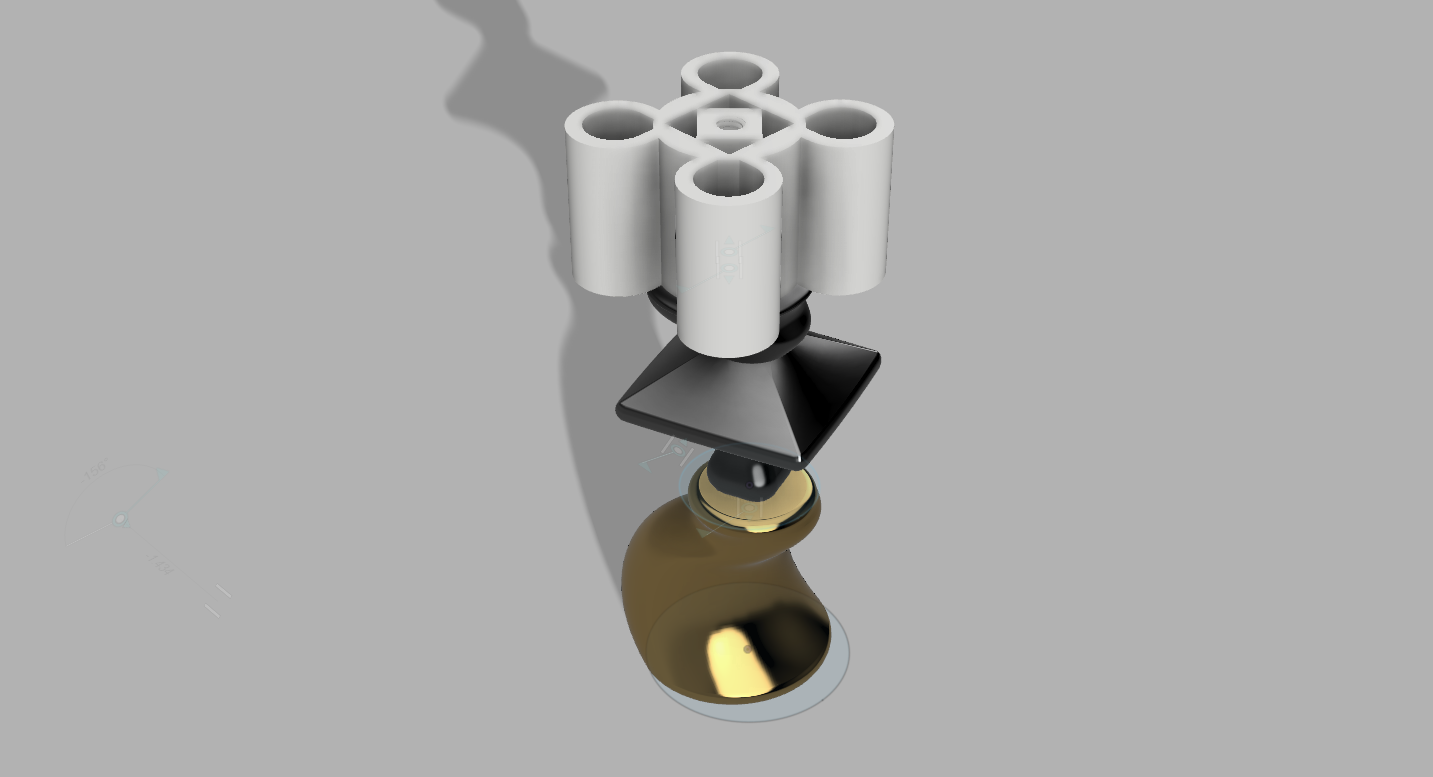
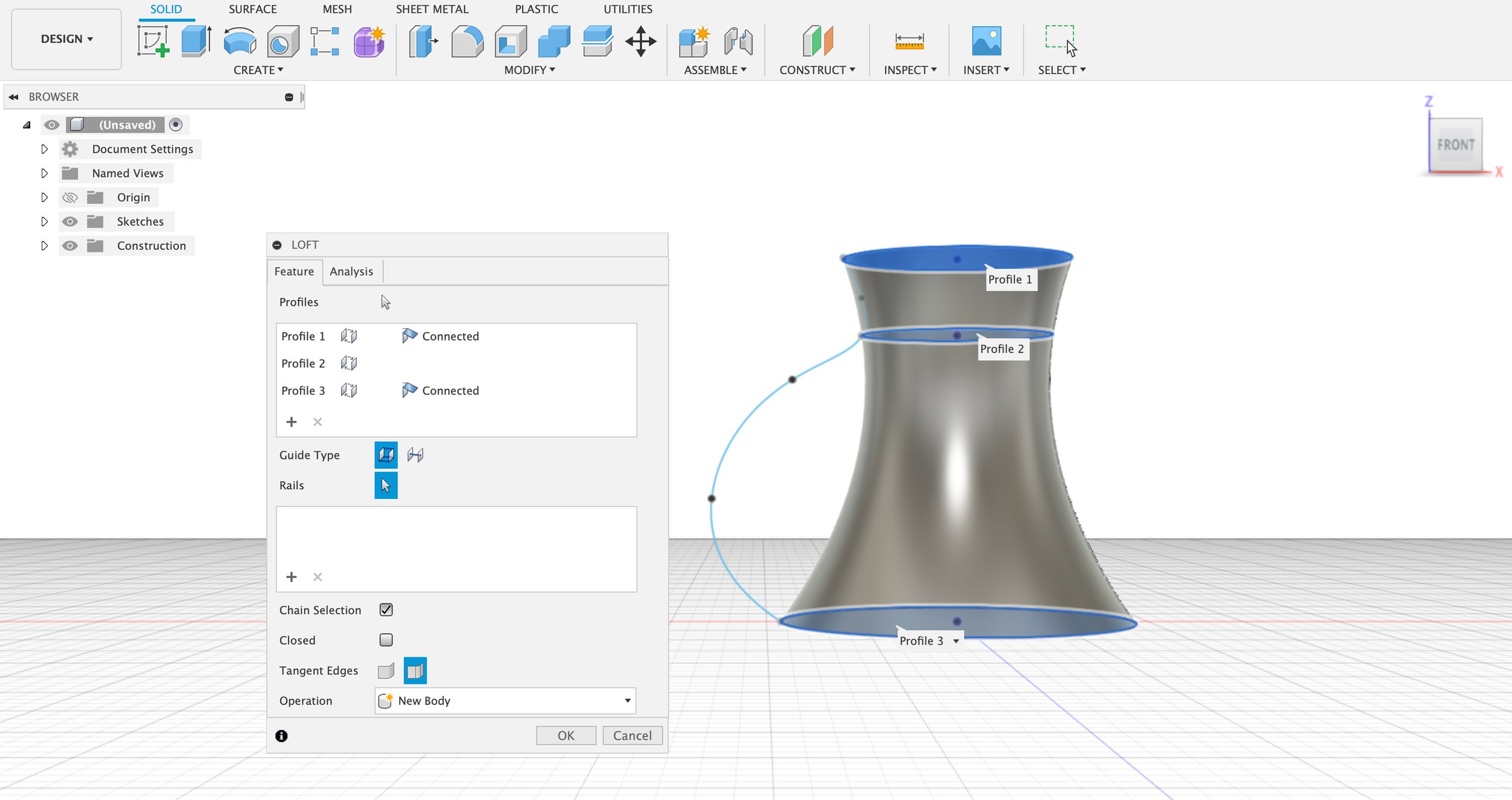
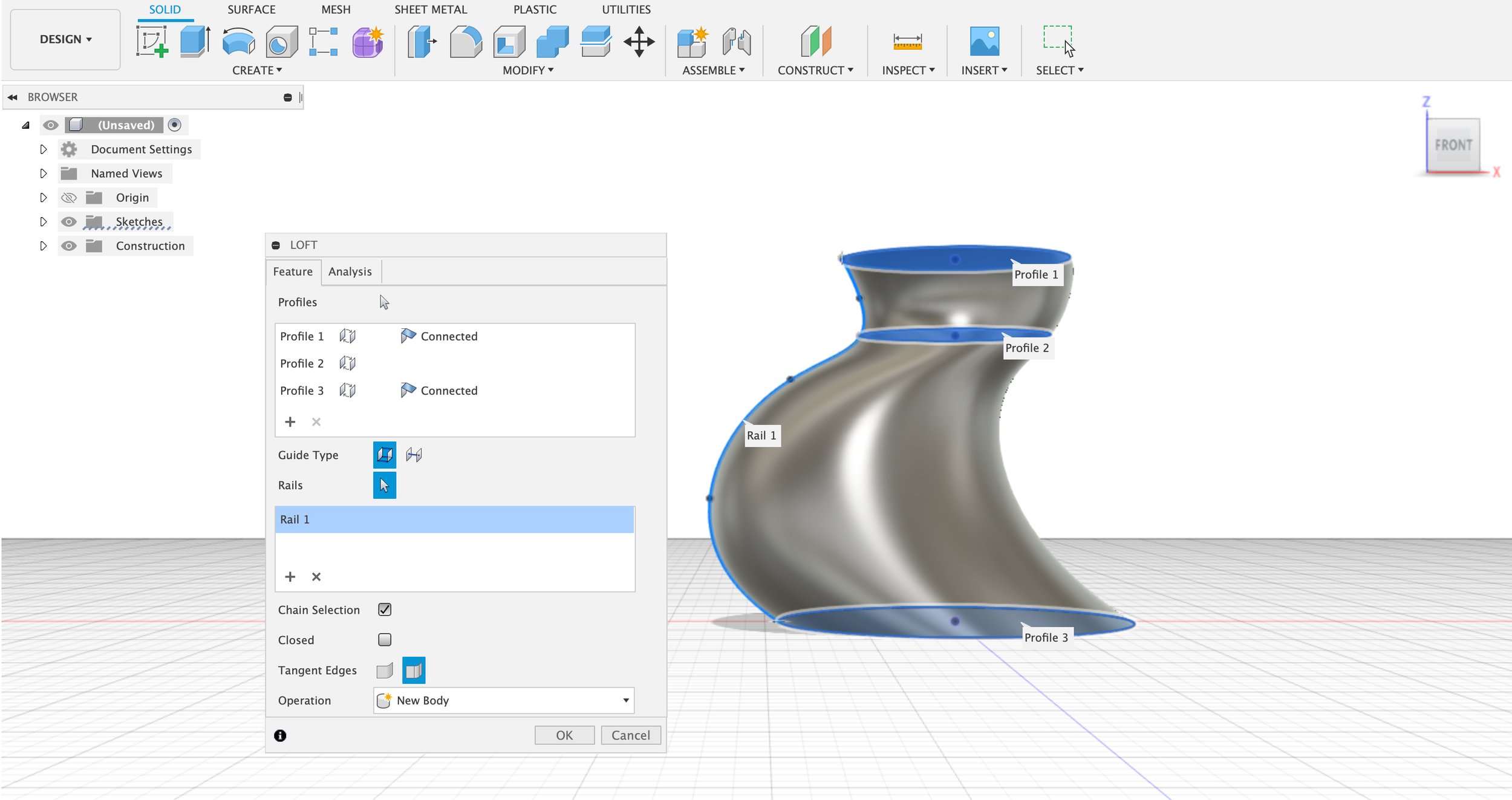
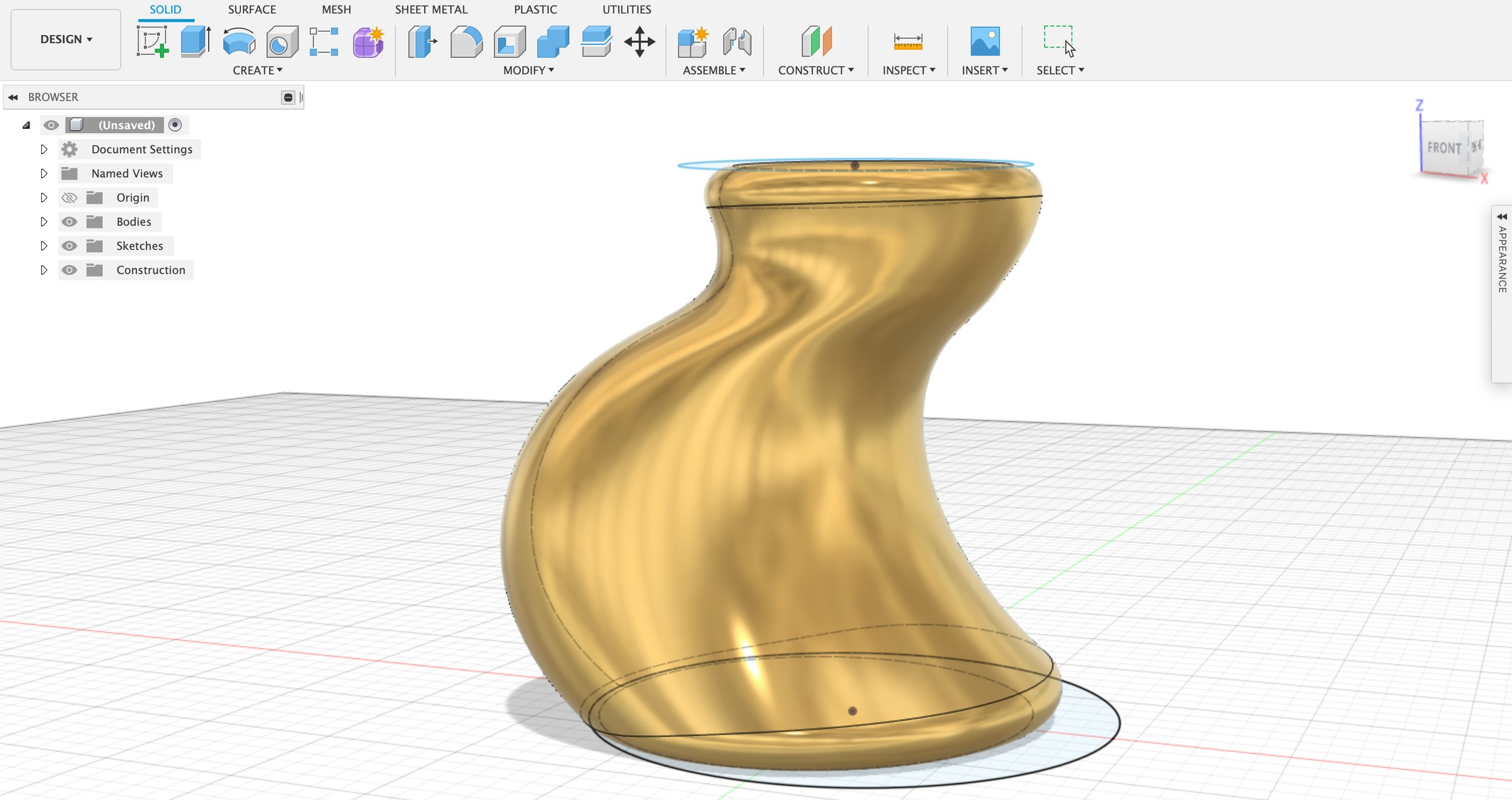
In our last class, we reviewed constructing multiple profiles and connecting them with the loft feature. I decided to practice using loft and understanding how the guide rails work to make my part with two internal threads.

Week 3: 3D Modeling

This week in CAD: more 3D modeling. Our assignment was to create different models using some of the newly learned techniques from this week (such as shell, web, revolve, and combine) and make a dimensioned drawing.

My 3D Models

I started with my own attempt at modeling the ice cube tray using the tutorial we reviewed together in class. This 3D model incorporated extruding, filleting, and revolving parts of the sketch, and utilized the rectangular pattern to duplicate the ice cube mold.

Ice Cube Tray

My ice cube tray in Fusion 360.

Bento Box

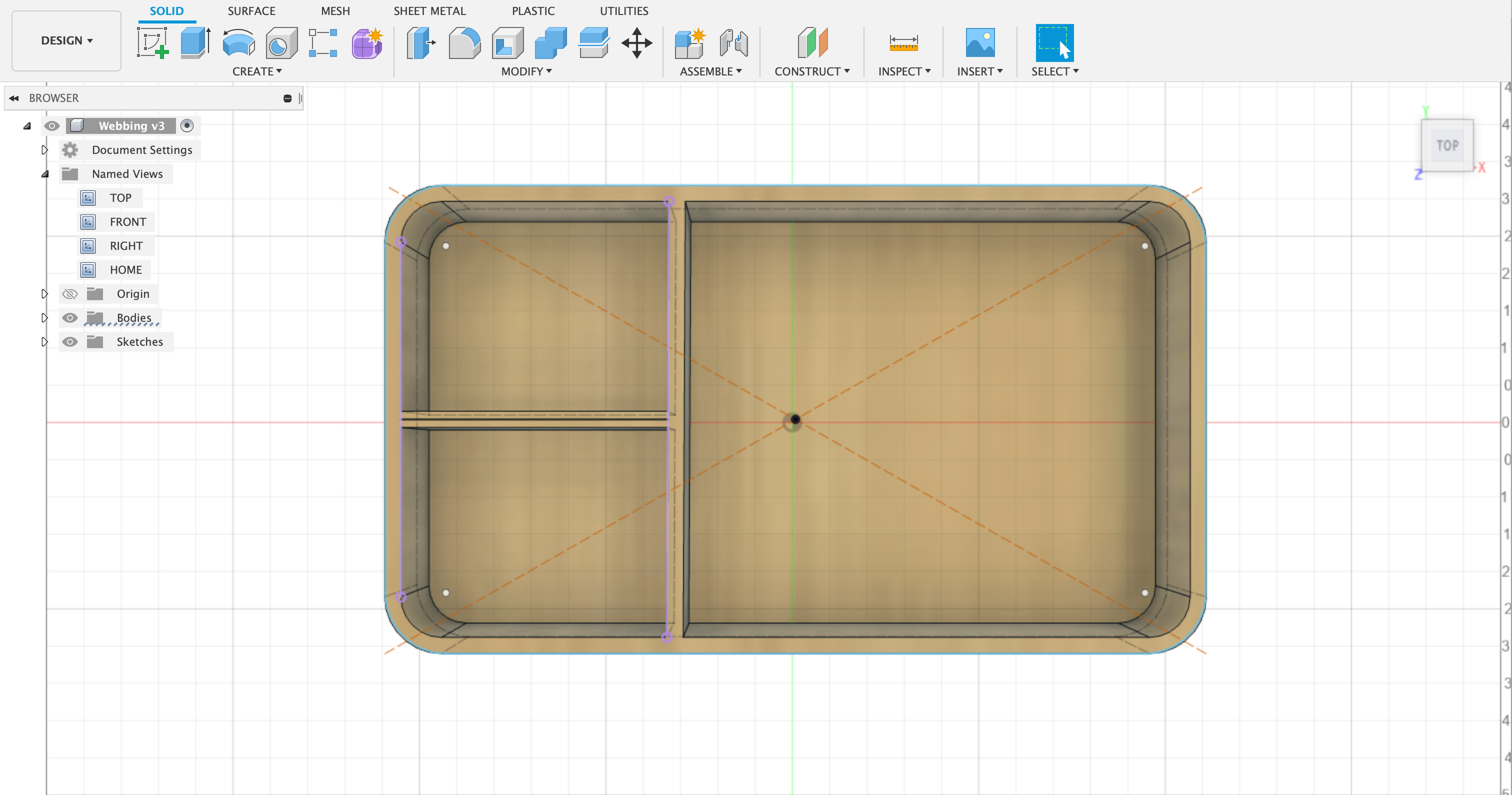
The next model I created was a bamboo bento box to try out webbing for the divider walls.

The home view of my bento box with a bamboo lid.

The top view of the bento box with inside divider walls created with the web tool.

Week 2: Extrusions

Our assignment for Week 2 was to create a new extrusion in Fusion 360 by finding a dimensioned drawing of an extrusion, creating a sketch of the cross-section, and extruding the sketch to create a 3D model.

Dimensioned Drawing

This was the final dimensioned drawing I chose to work with in Fusion 360: a 40x20 aluminum extrusion.

My Extrusion

I did find it helpful that this 40x20 extrusion drawing was symmetrical and most of the dimensions were even numbers, and it was beneficial to have a sheet of paper and a pen to make additional calculations and jot down numbers that were not marked on the drawing. I started my sketch in Fusion 360 with a combination of construction lines and rectangles on the left side before replicating it on the right side. This assignment was a great opportunity to become more familiar with the basic sketch tools while realizing there is still more I want to learn about how to best approach creating a drawing or making my sketch more precise.

The sketch in progress.

The completed sketch ready for extrusion.

The final 3D model of the extrusion.